fenwood residence
the clients at fenwood were ready to settle down in cleveland full-time and wanted a space that reflected their personality and vibe. sadie was immediately inspired by their eclectic, carefully-considered style.
designer
sadie bauchmoyer
rooms
living room, entryway and hallways, primary bathroom, secondary bathroom, powder room
location
university heights, ohio
style
Classic with a modern twist; unique, timeless, tailored
photography
hilary bovay
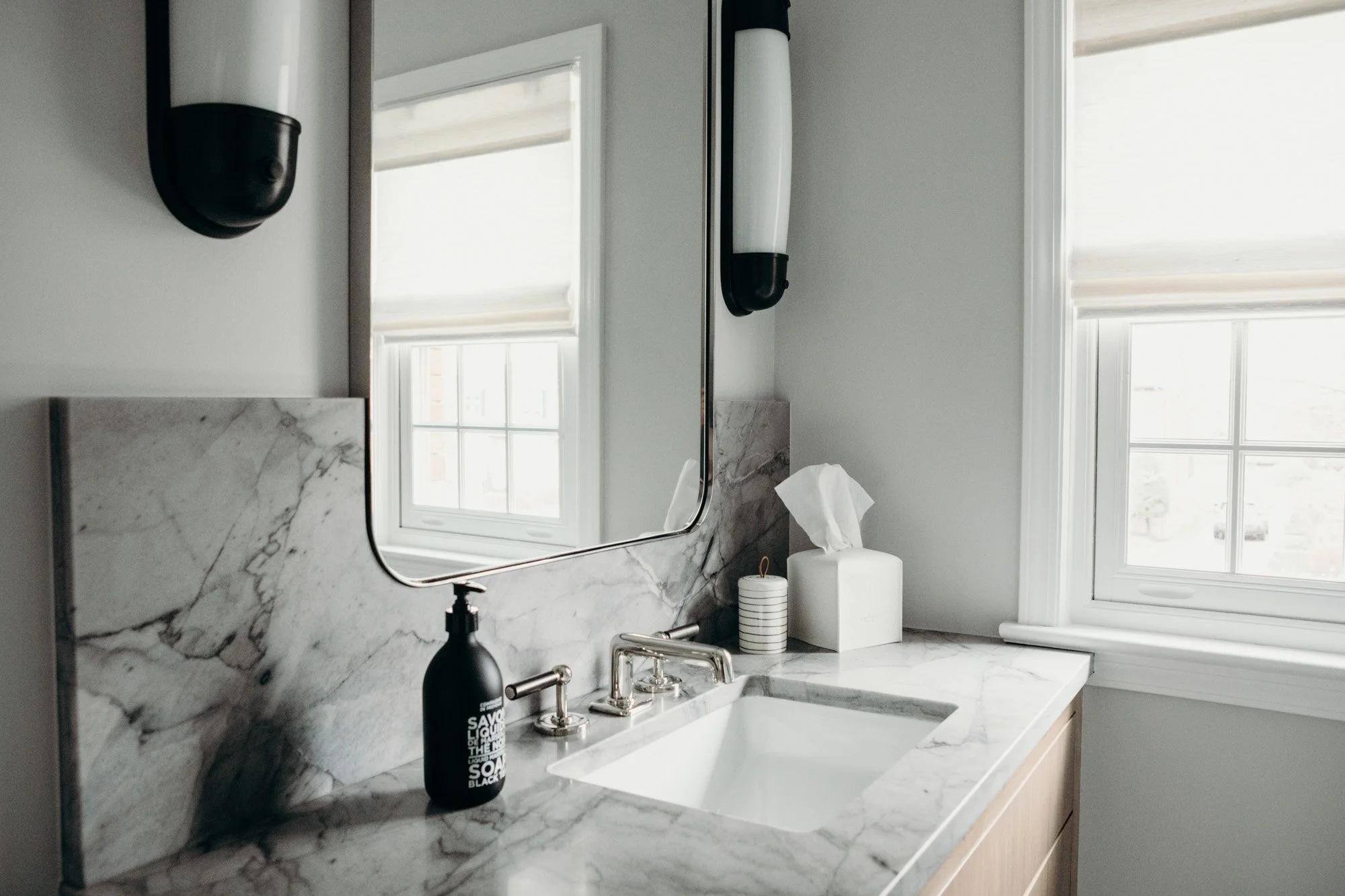
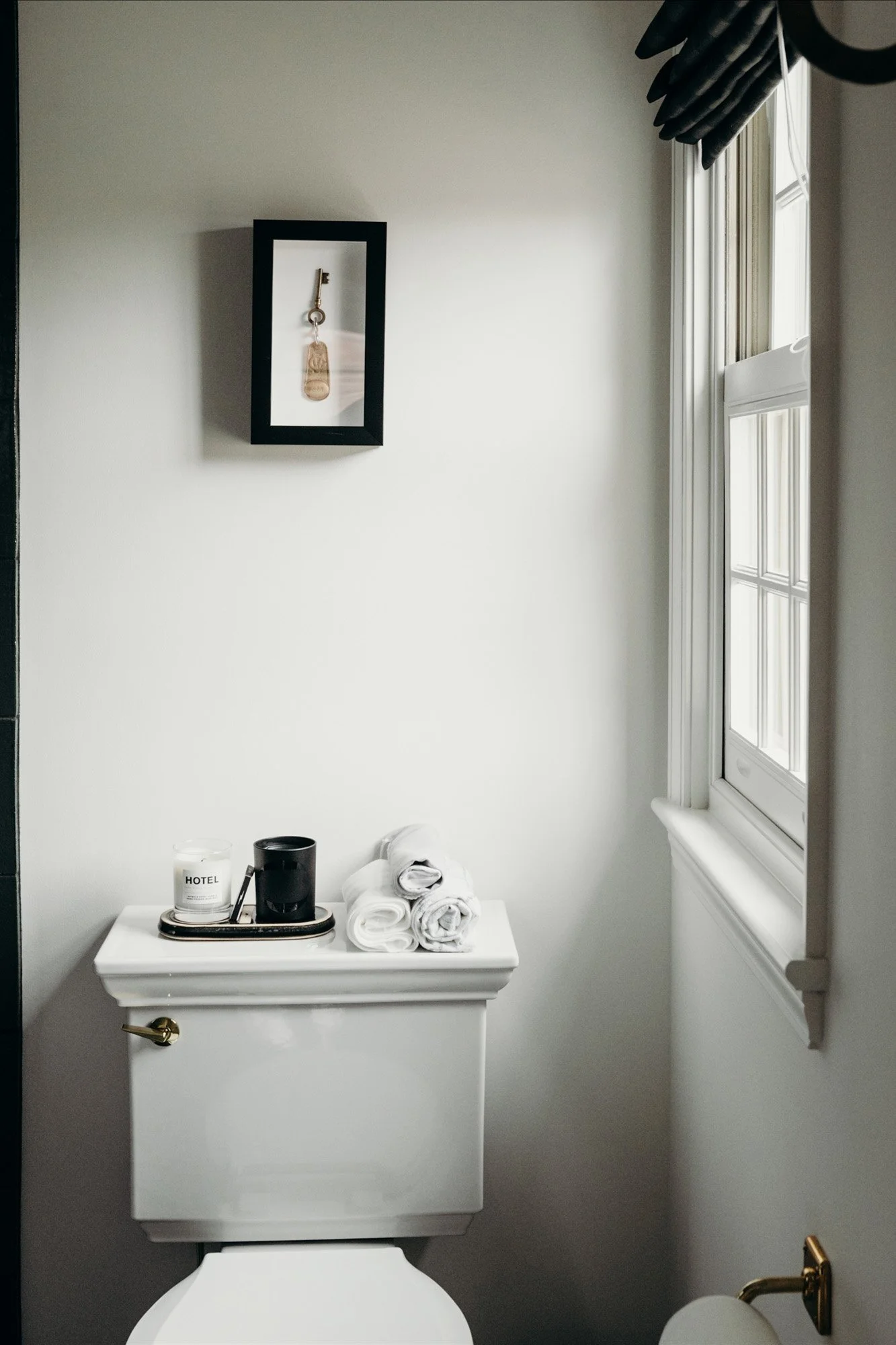
The first spaces to be completed were the upstairs bathrooms, one for each member of the home. Each bathroom perfectly reflects its person—one a bit more bold, and the other a more subdued, neutral-leaning approach.
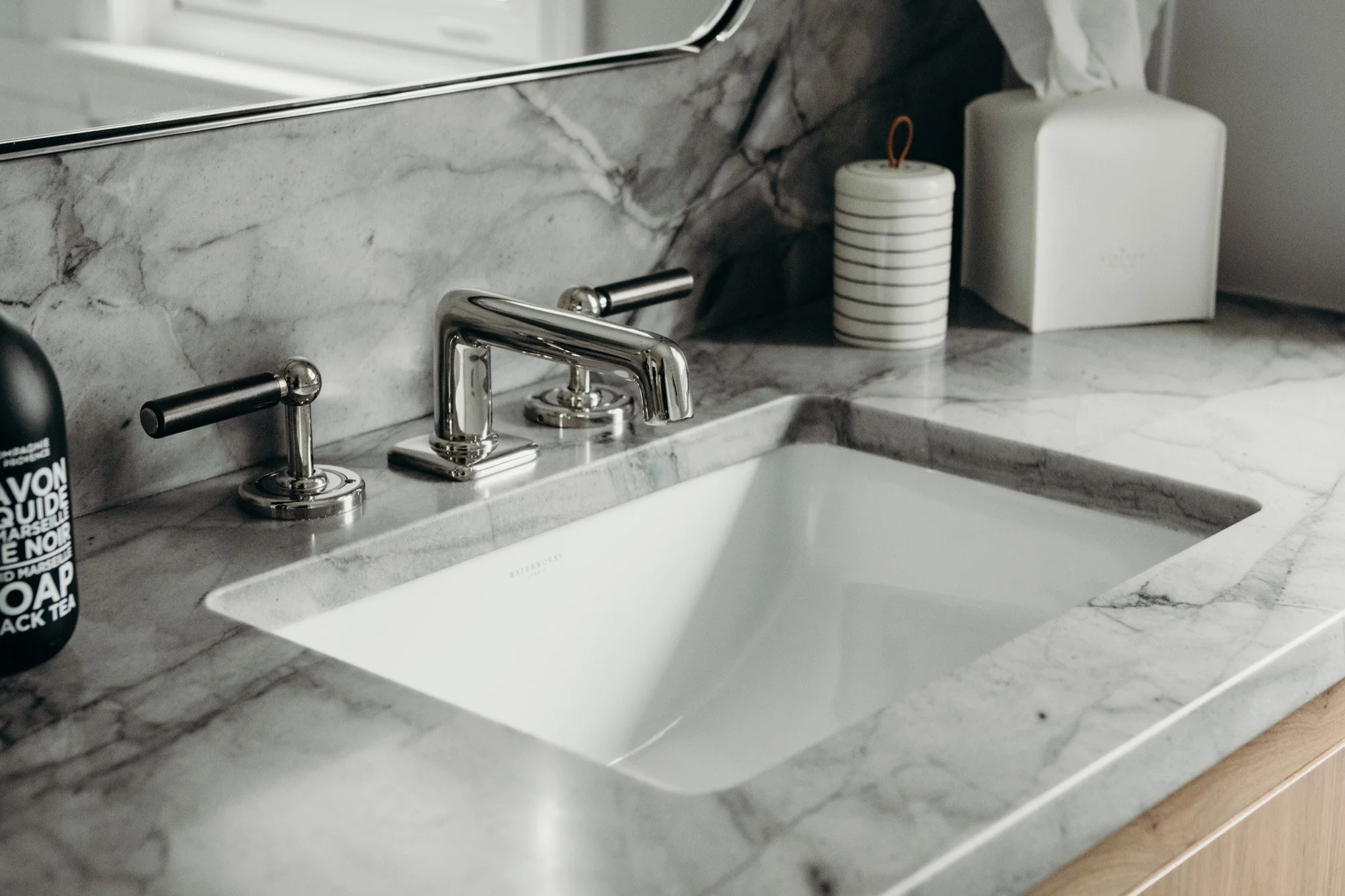
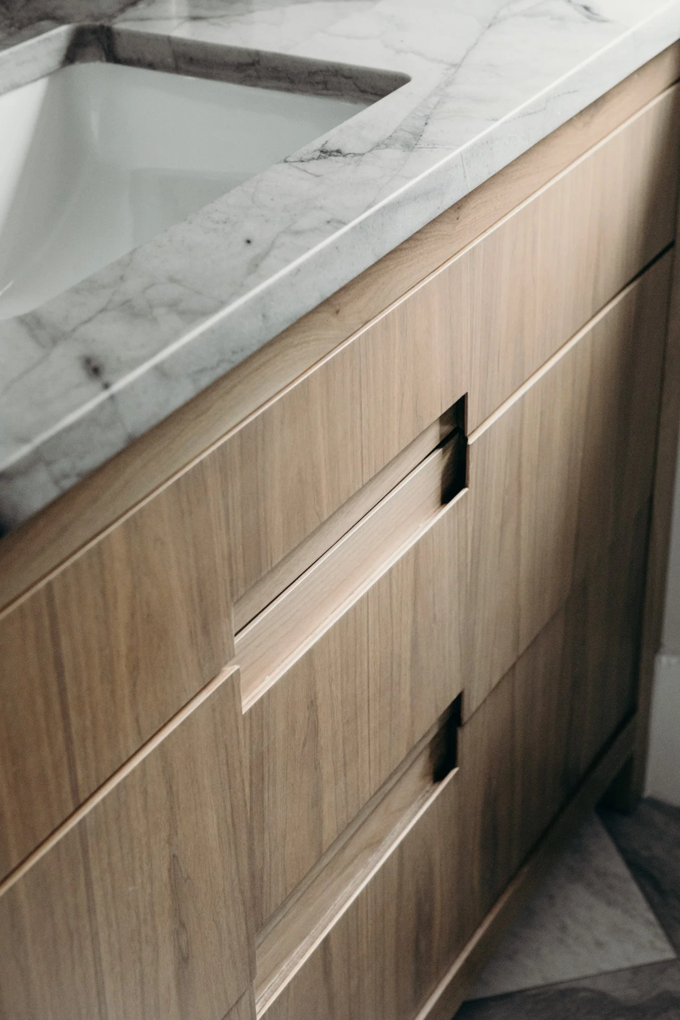
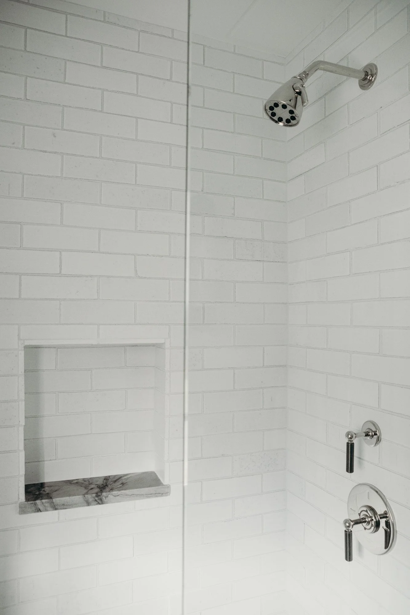
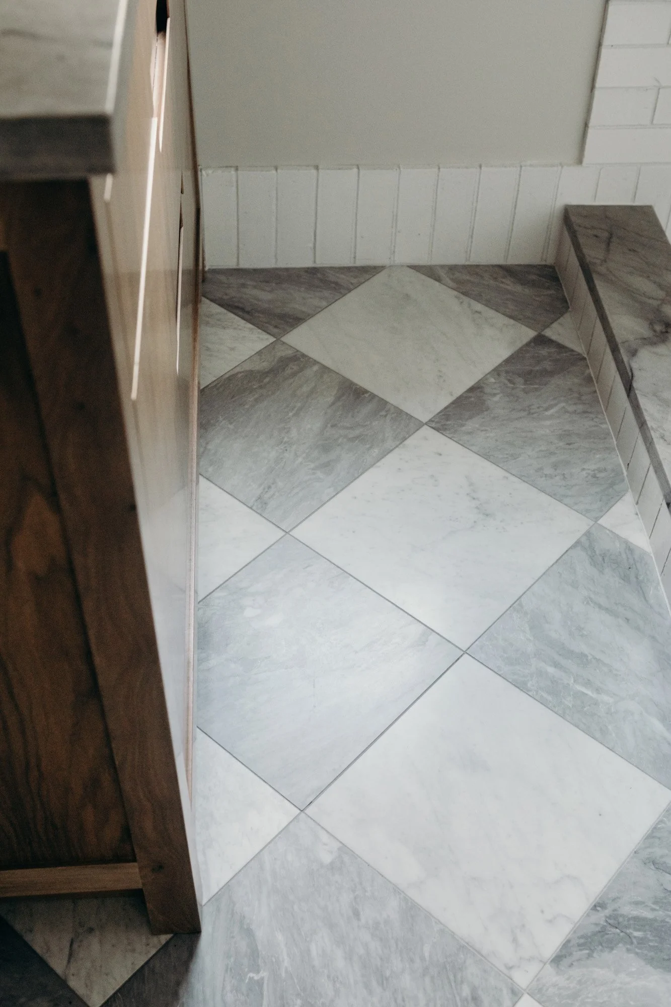
Both bathrooms were reconfigured in order to maximize space. In the neutral bathroom, handmade variegated stone tiling on the walls brings unexpected texture. The walnut vanity, with seamless integrated hardware, satisfied a desire for ease. Faucets and plumbing were upgraded. The quartzite countertop features a cutout backsplash, allowing the vanity mirror to lay inset.
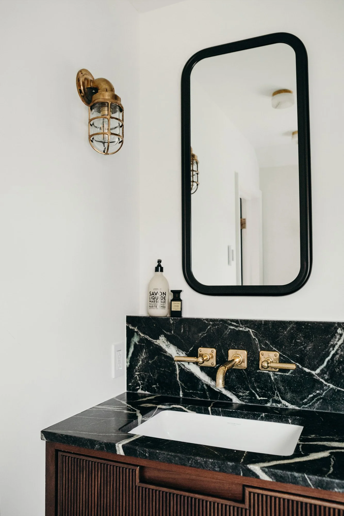
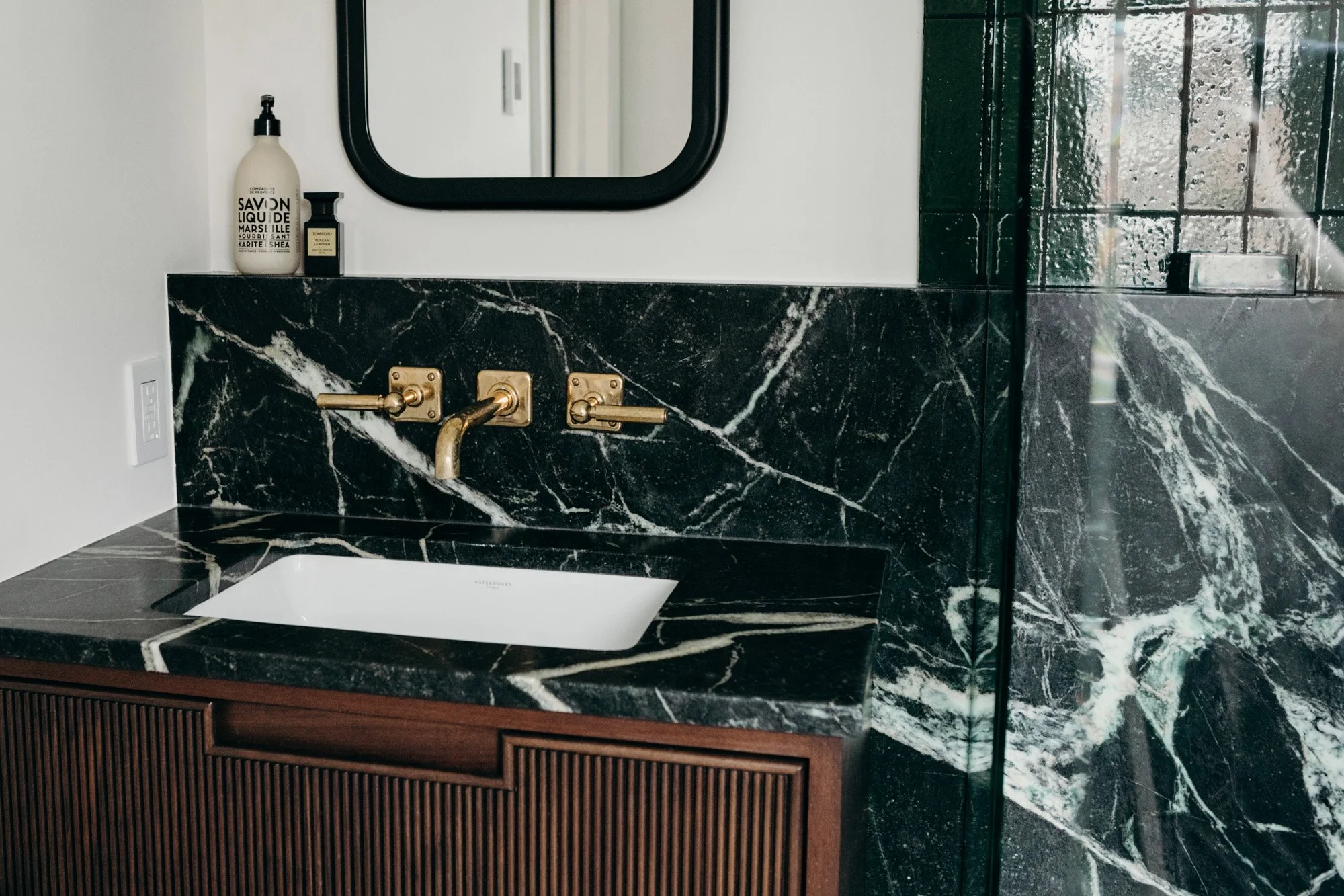
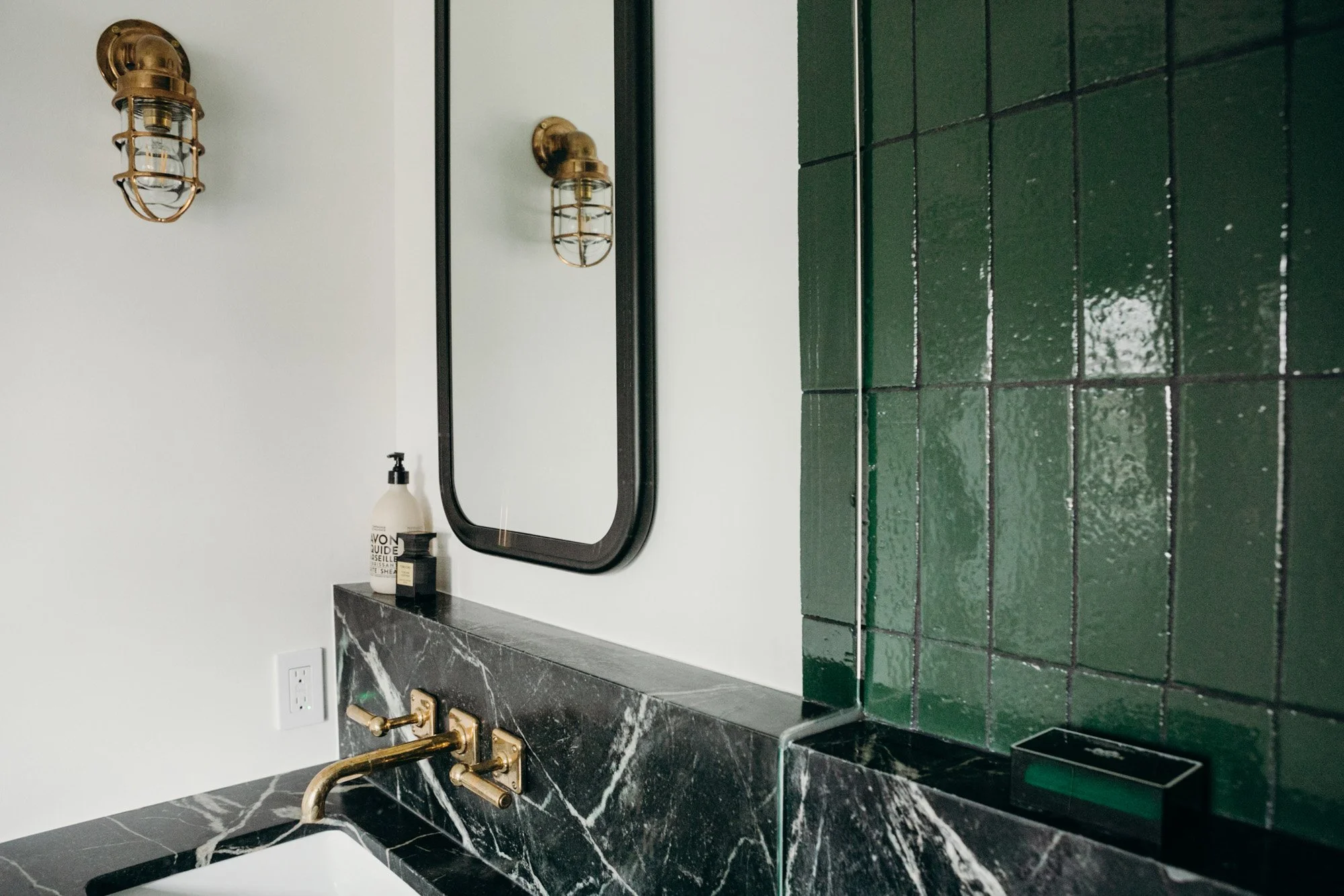
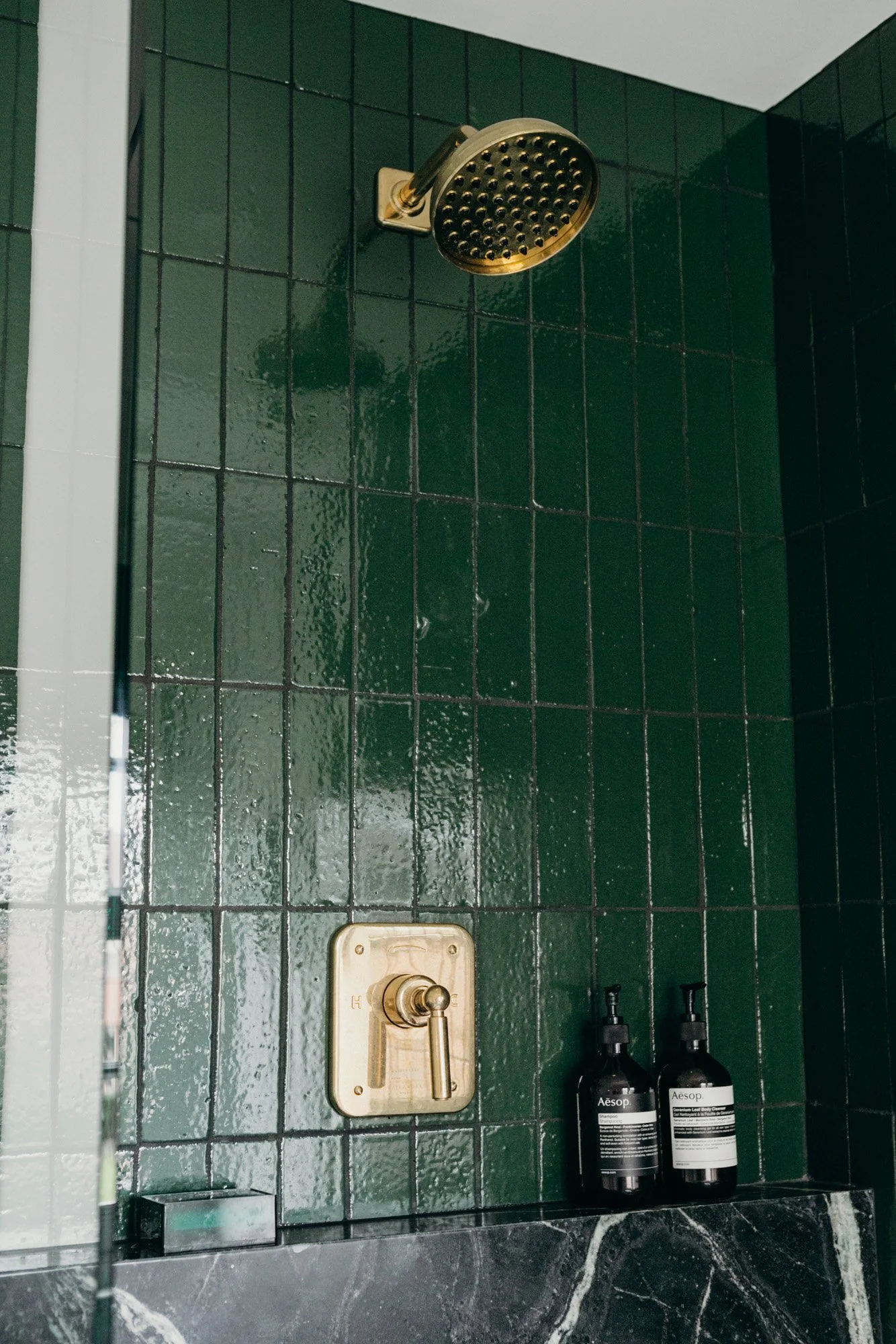
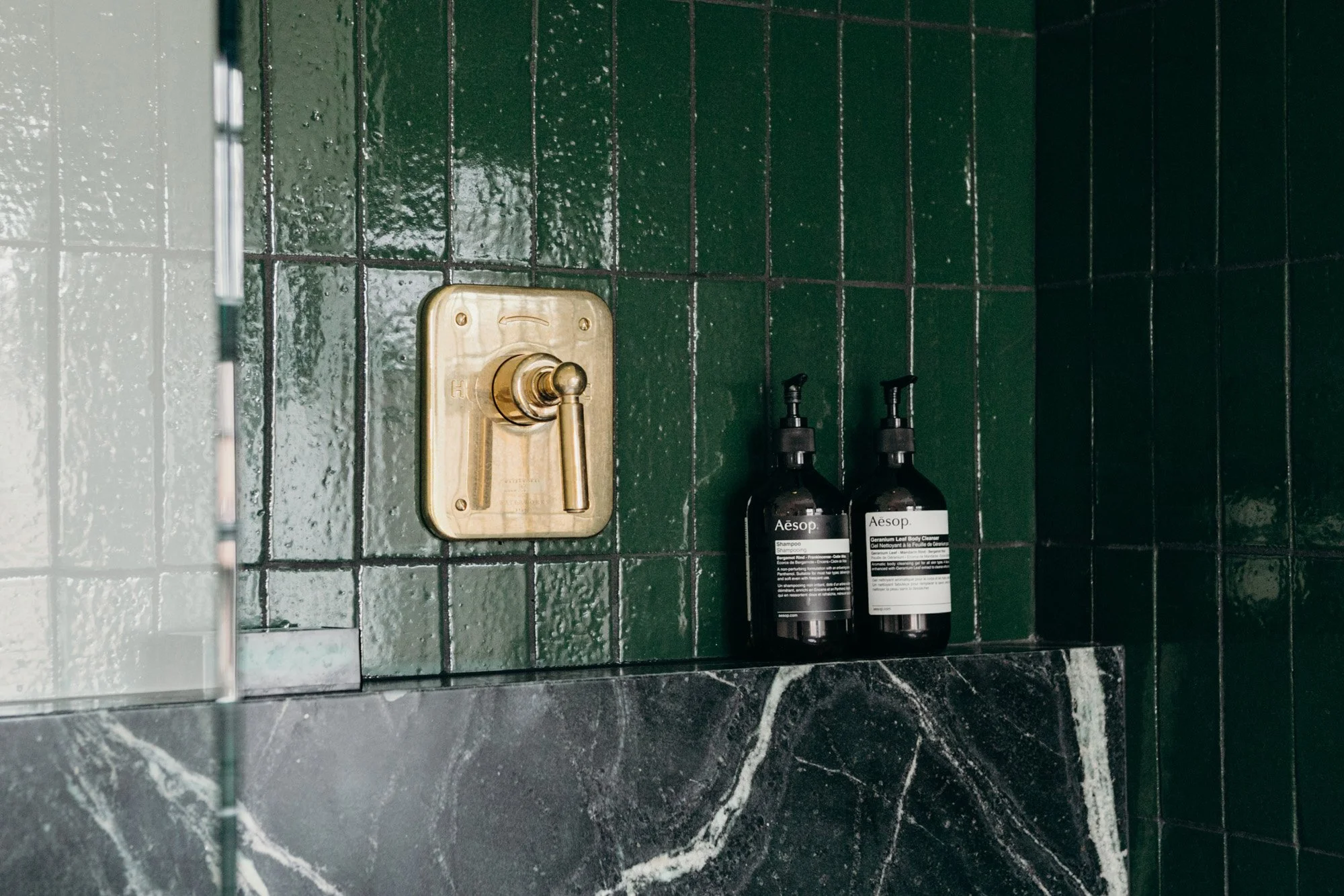
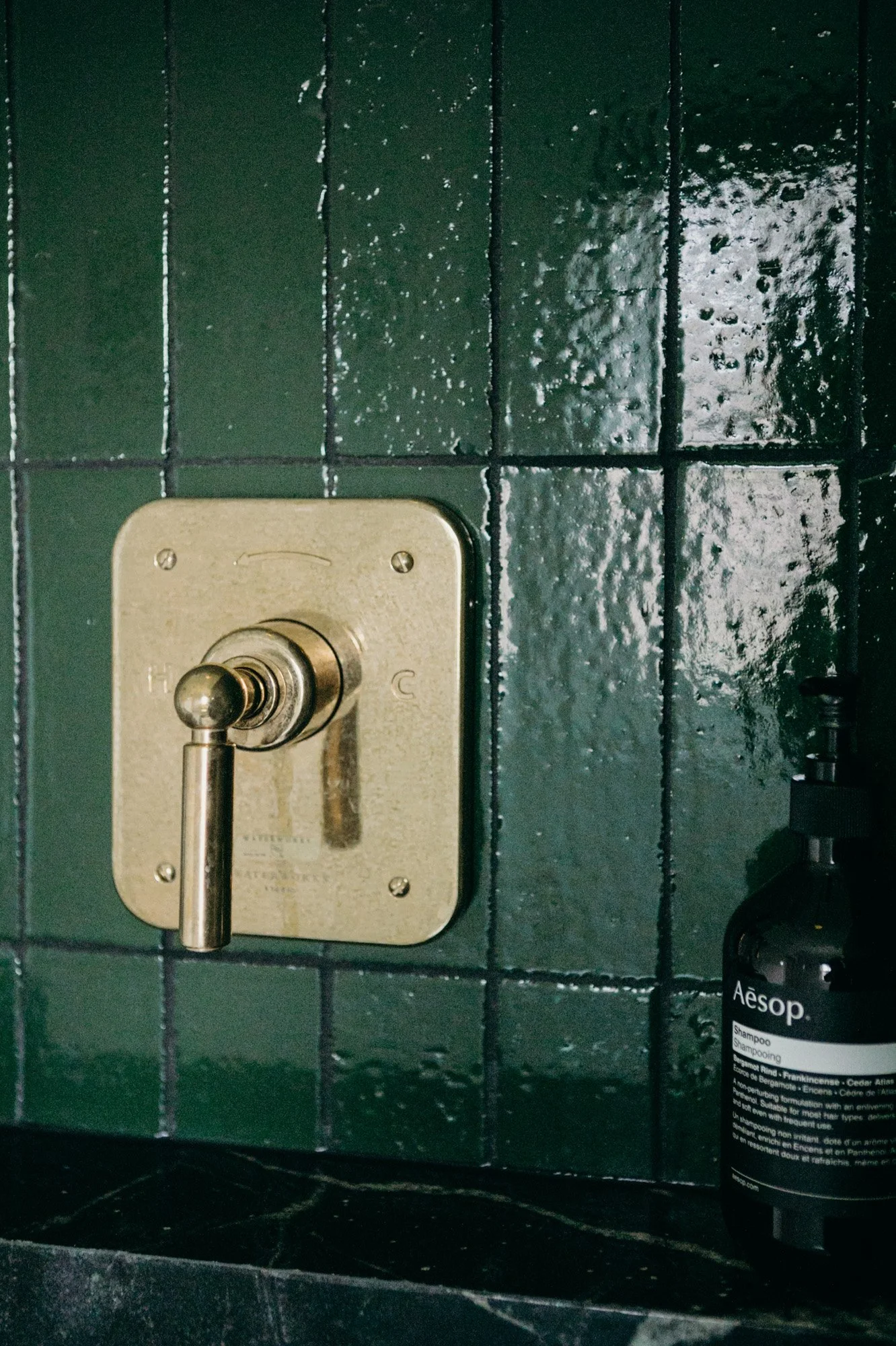
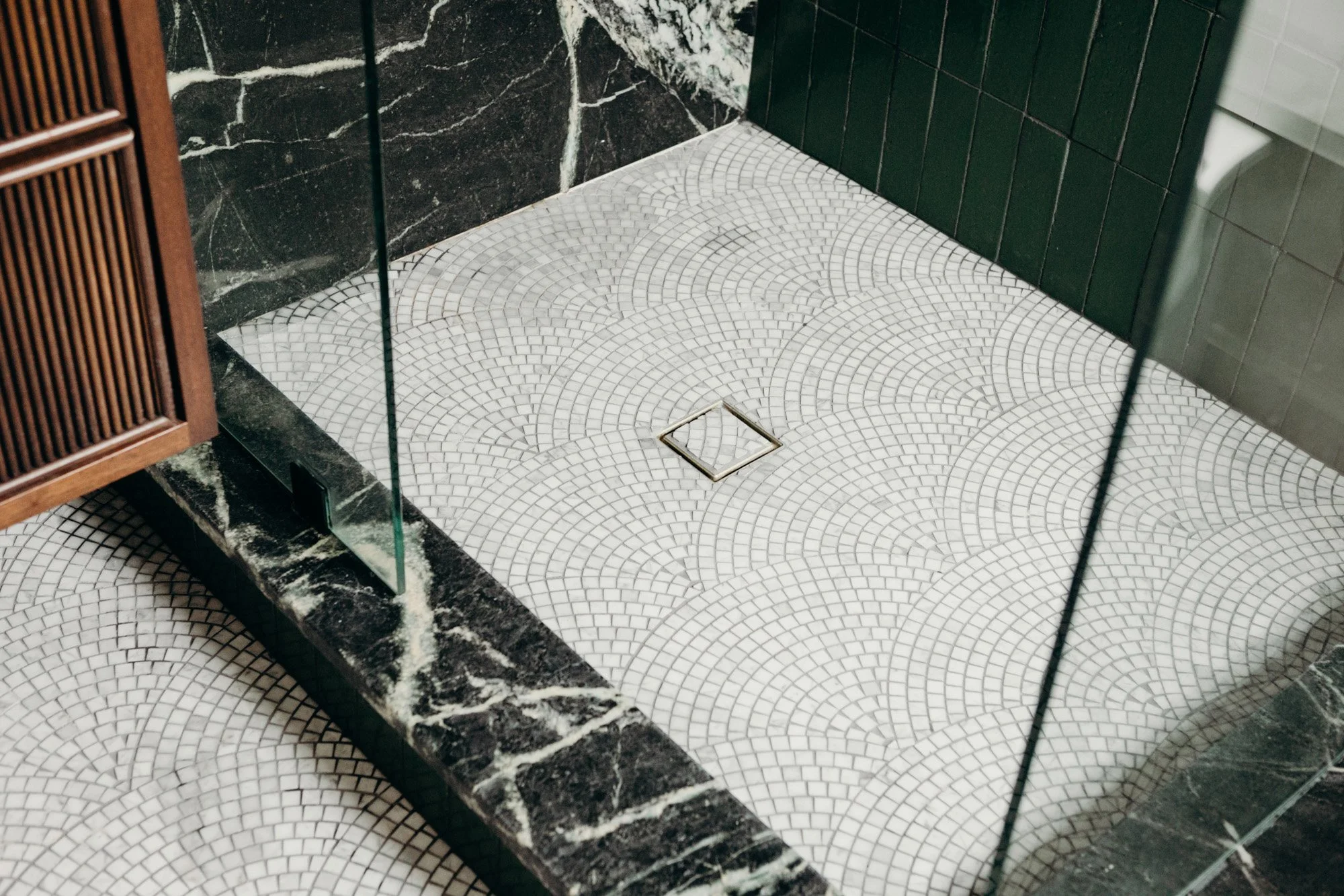
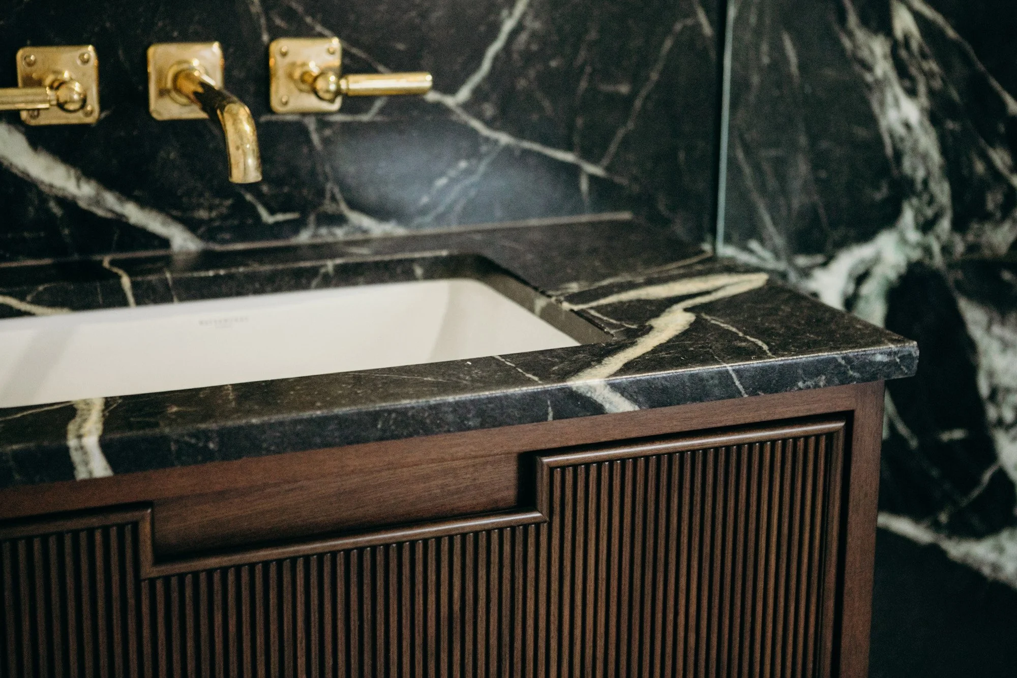
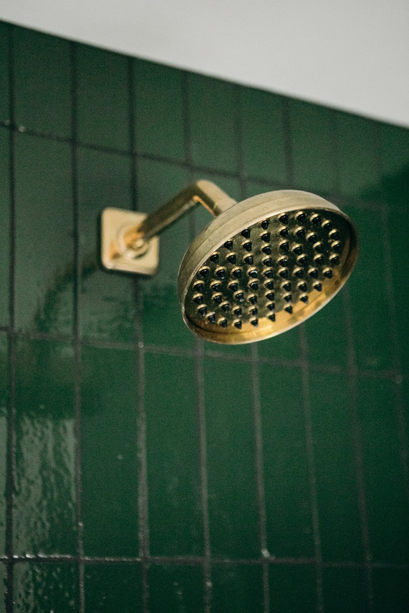
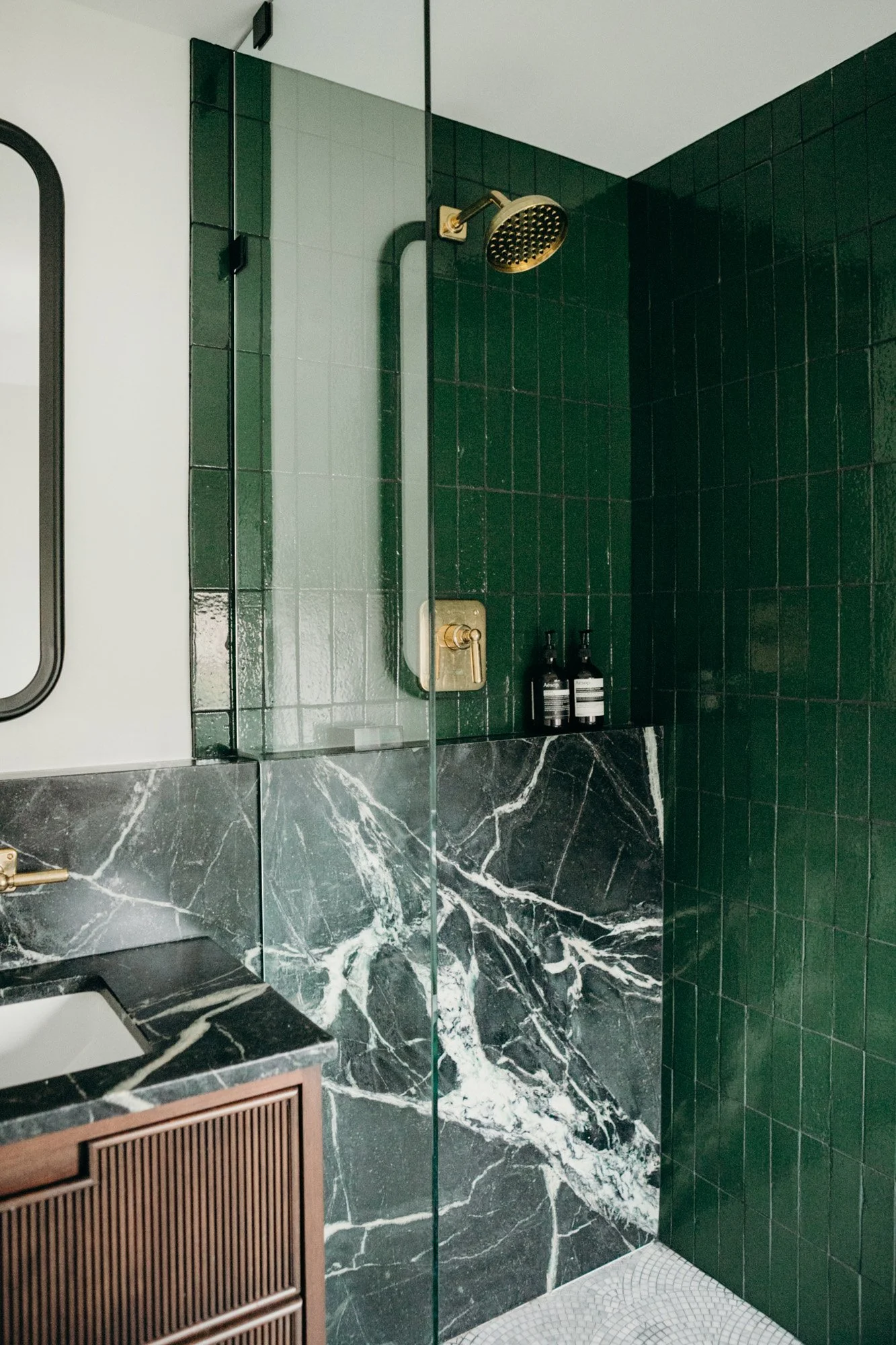
In the second bathroom, the client desired a pairing of soapstone, walnut wood, and green tile. Sadie paired these elements with unlacquered brass fixtures, giving the space an authentic, lived-in feel. A vintage glass sconce adds to the singular style of the room. Soapstone remains the star of the space, with a long shelf extending through the shower and vanity. The floated, reeded vanity features integrated hardware. On the floor, a marble art-deco-style fan mosaic pairs elegantly.
Once the upstairs projects began, the client desired a feeling of cohesiveness throughout the home, opting to add on a redesign of the living room, powder room and foyer.
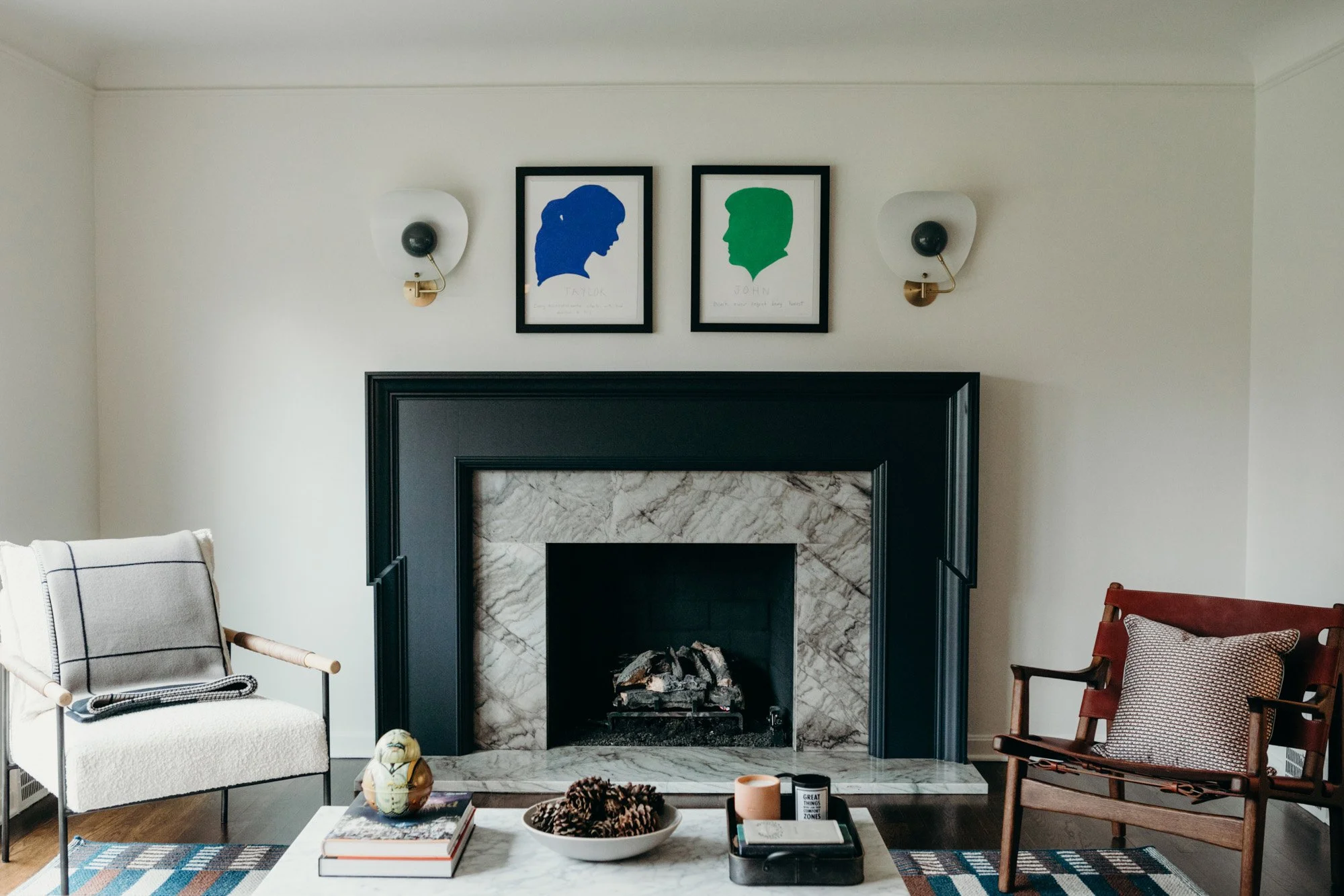
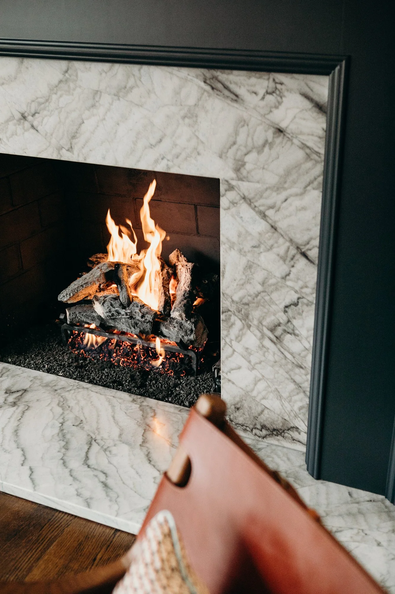
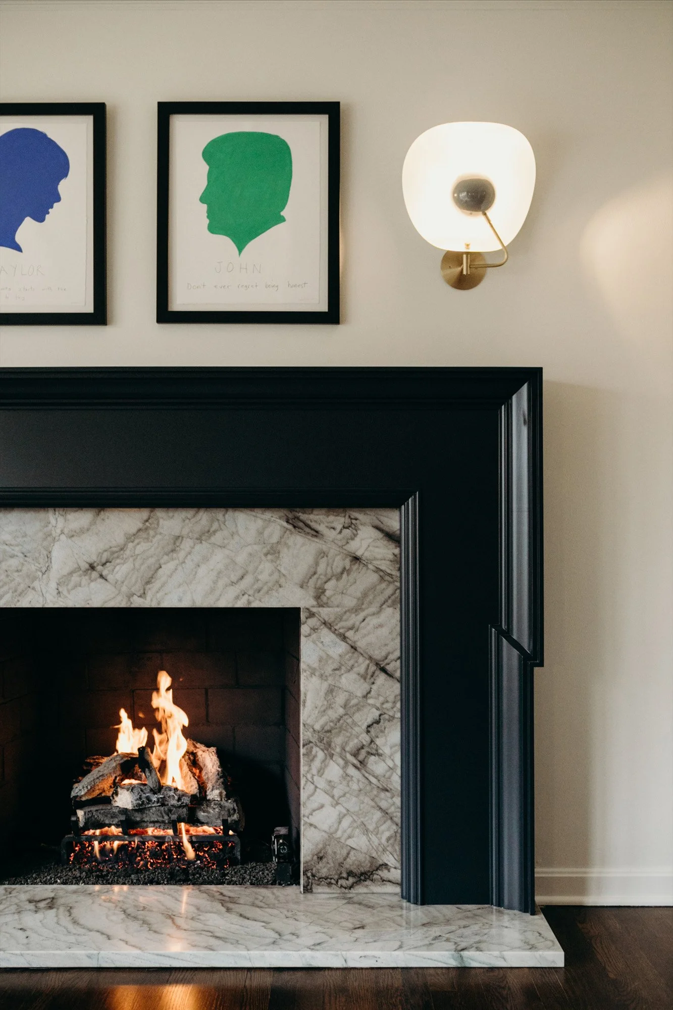
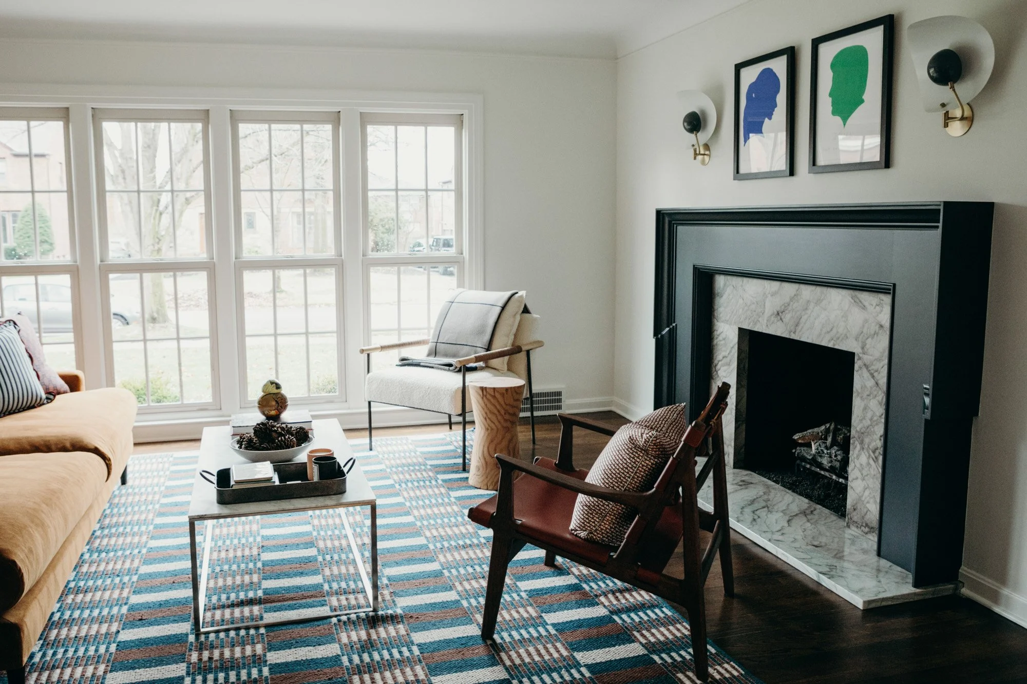
In the living room, Sadie refreshed the space with new paint and most importantly, a focal point via new design for the fireplace. Modern sconces flanking the fireplace add to the mood. The client chose pop-art-style silhouettes to hang above.
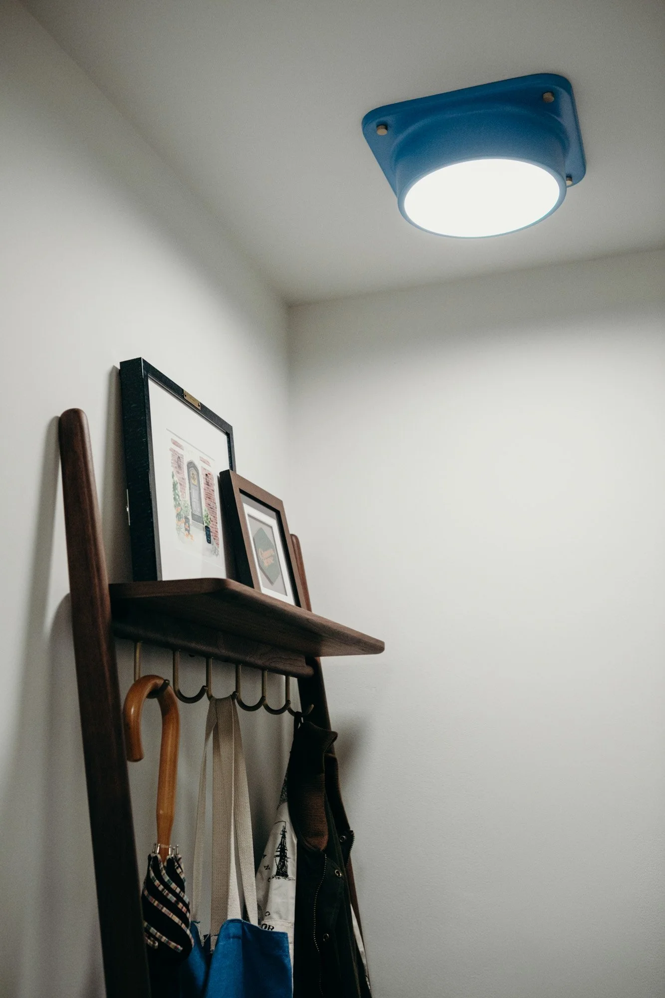
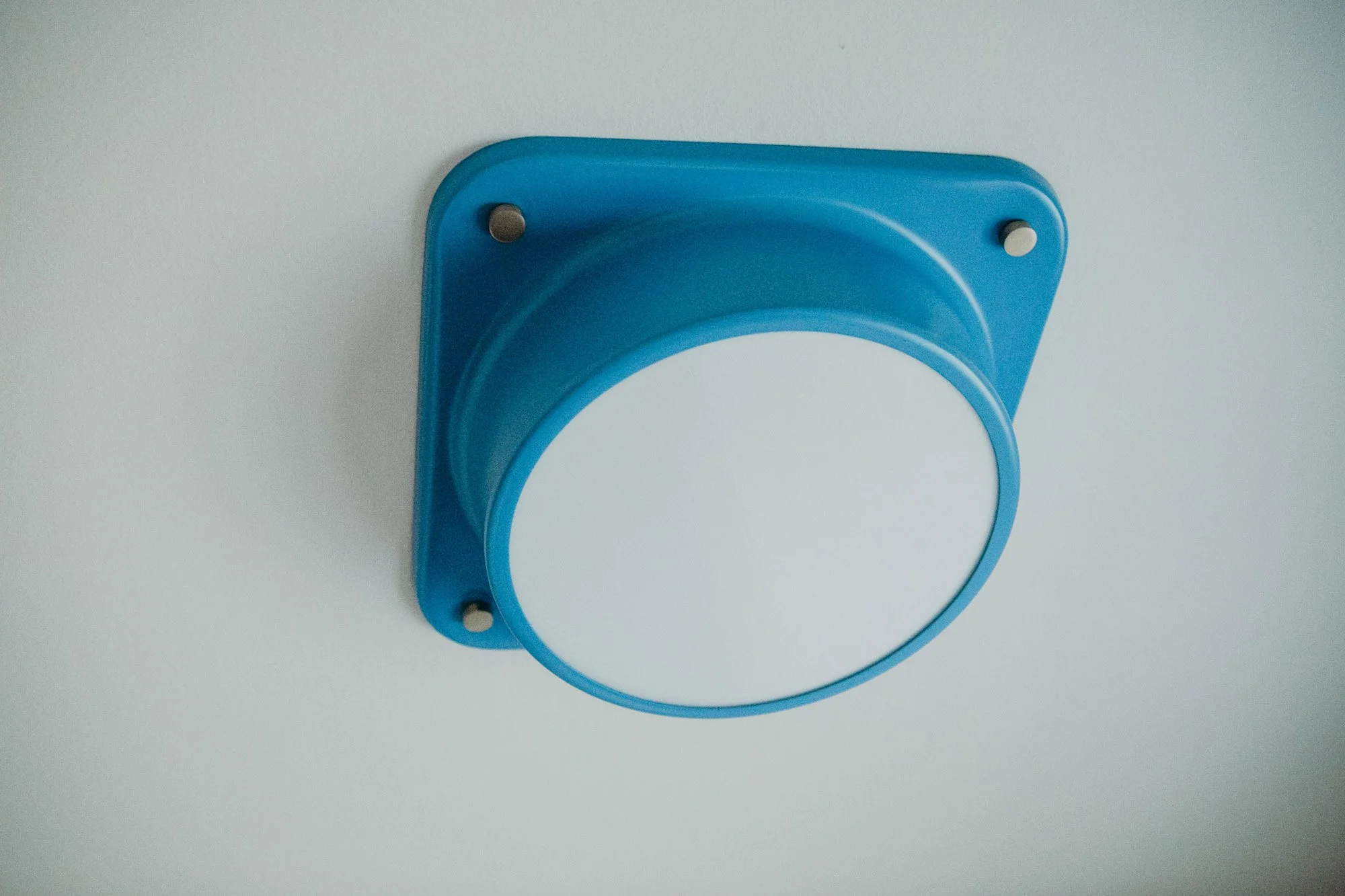
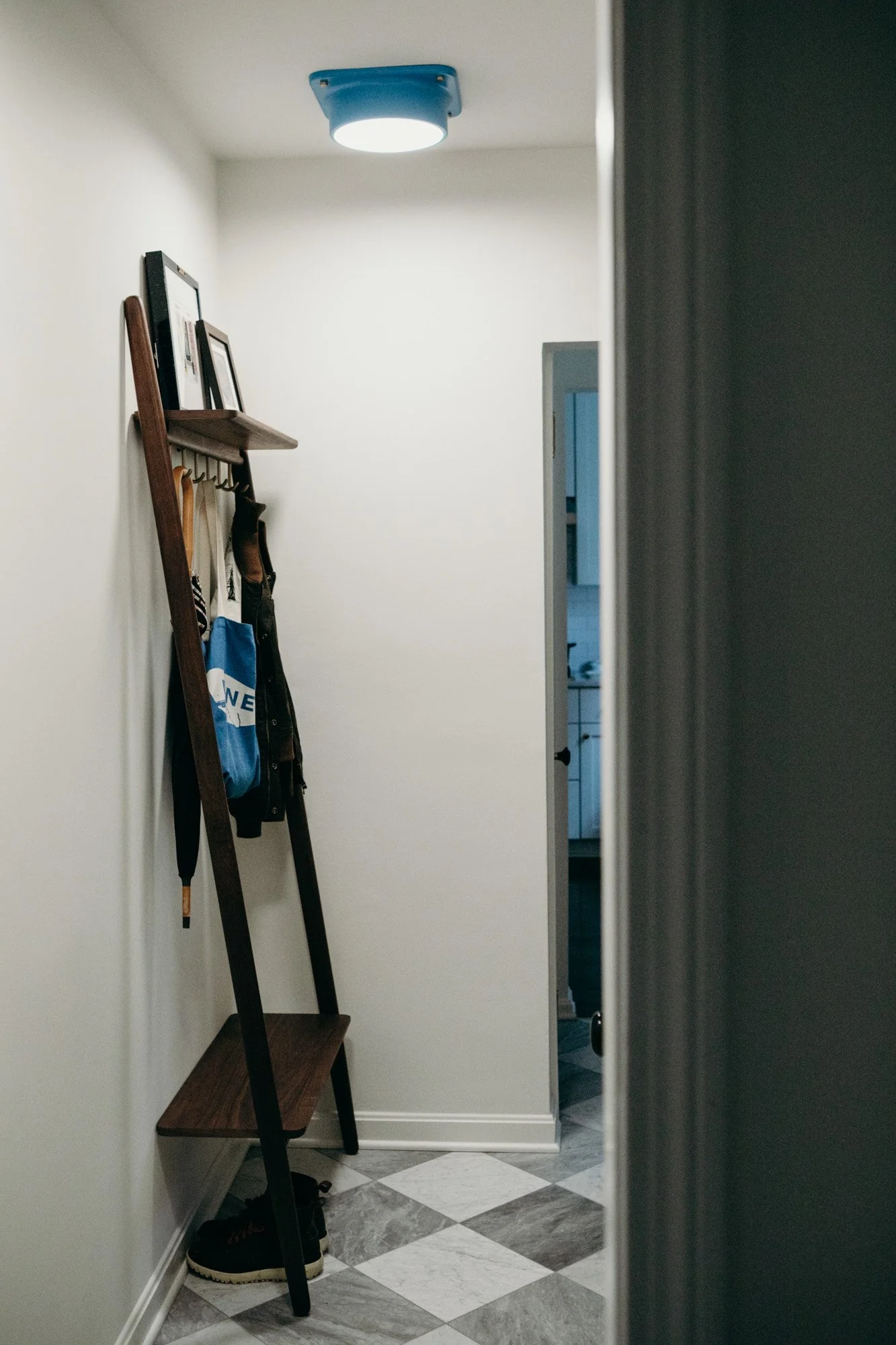
The connecting foyer had walls painted white to add openness. Disjointed floors were replaced with marble checkerboard—in the same fashion as the neutral upstairs bathroom—extending into the powder room to give the space a connected feeling. A bold blue light fixture, chosen by the client, adds an unexpected element to what could otherwise feel like a slightly formal space.
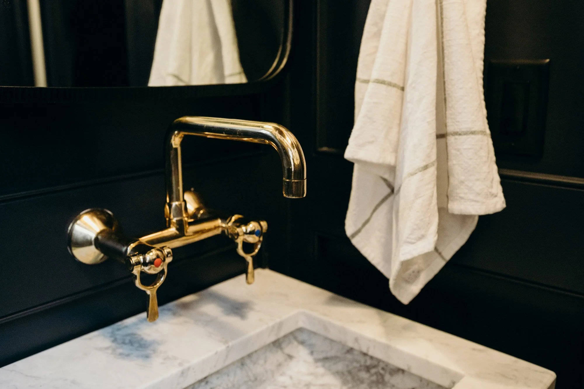
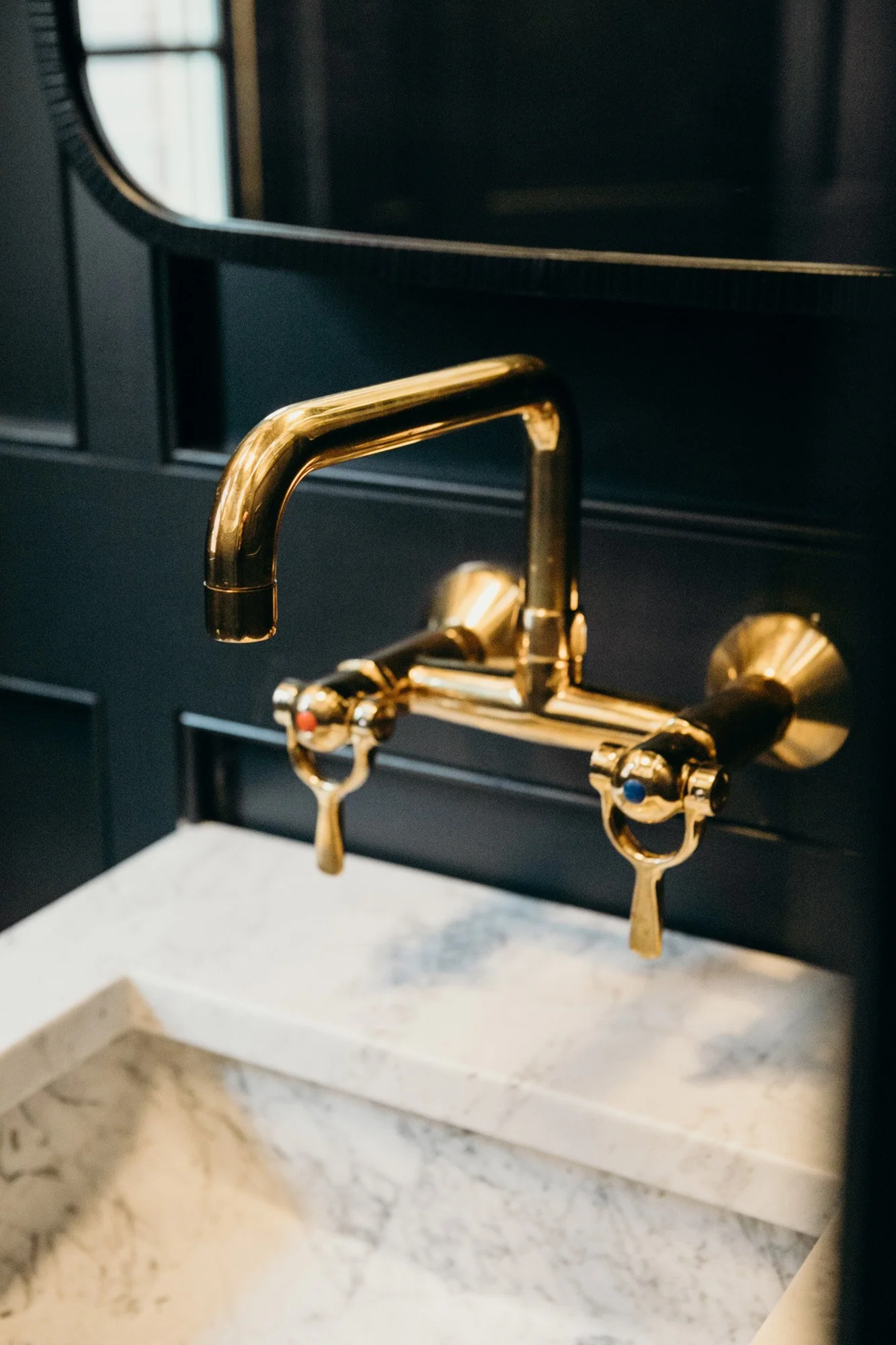
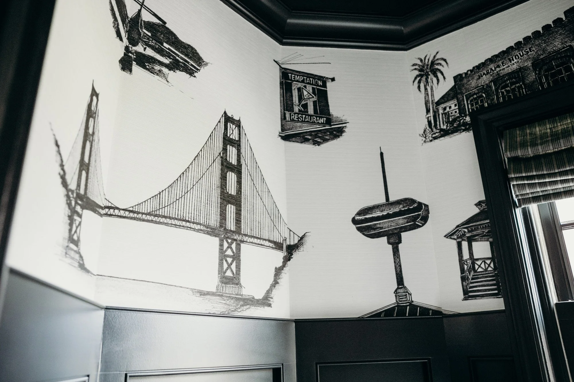
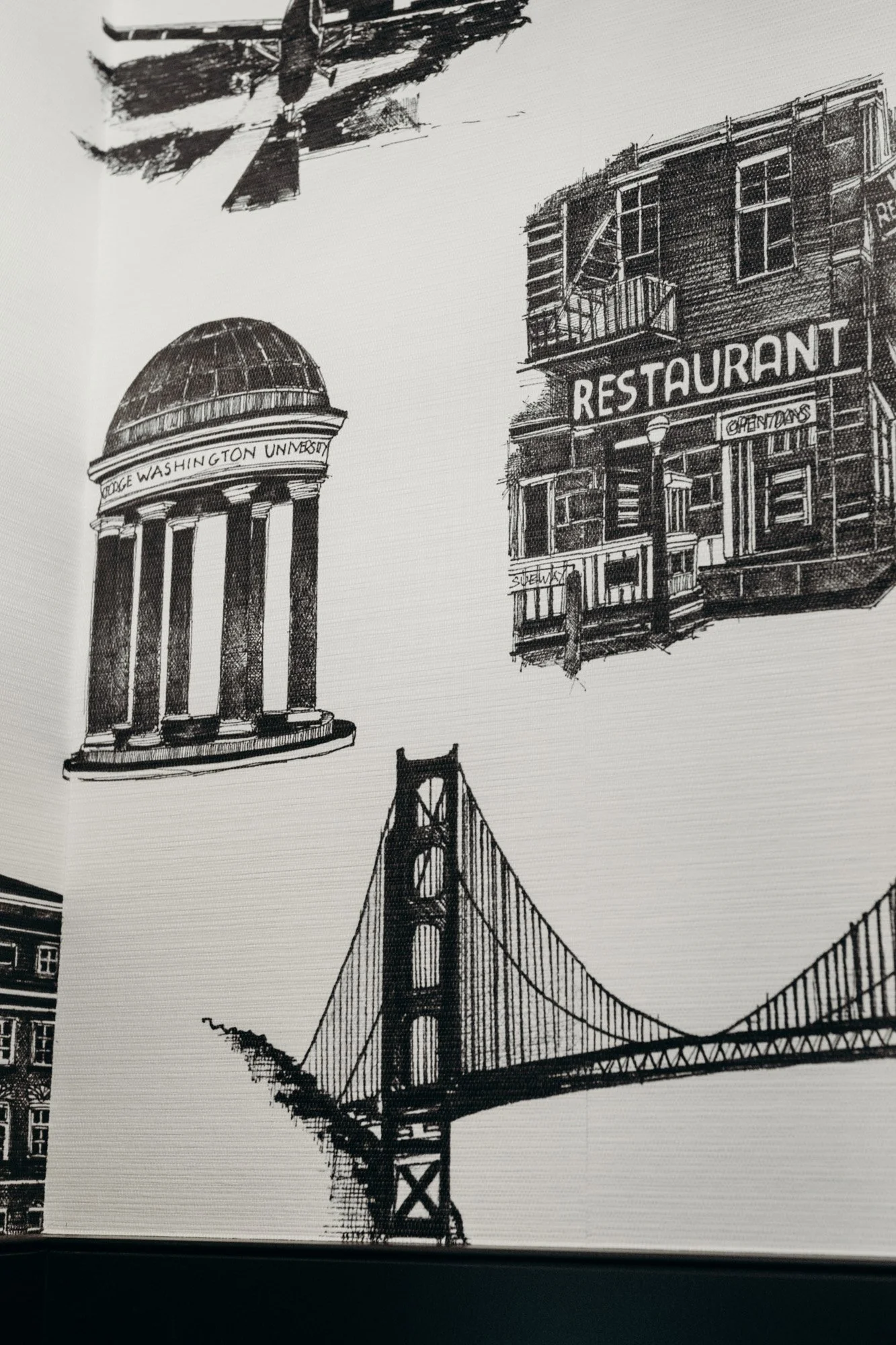
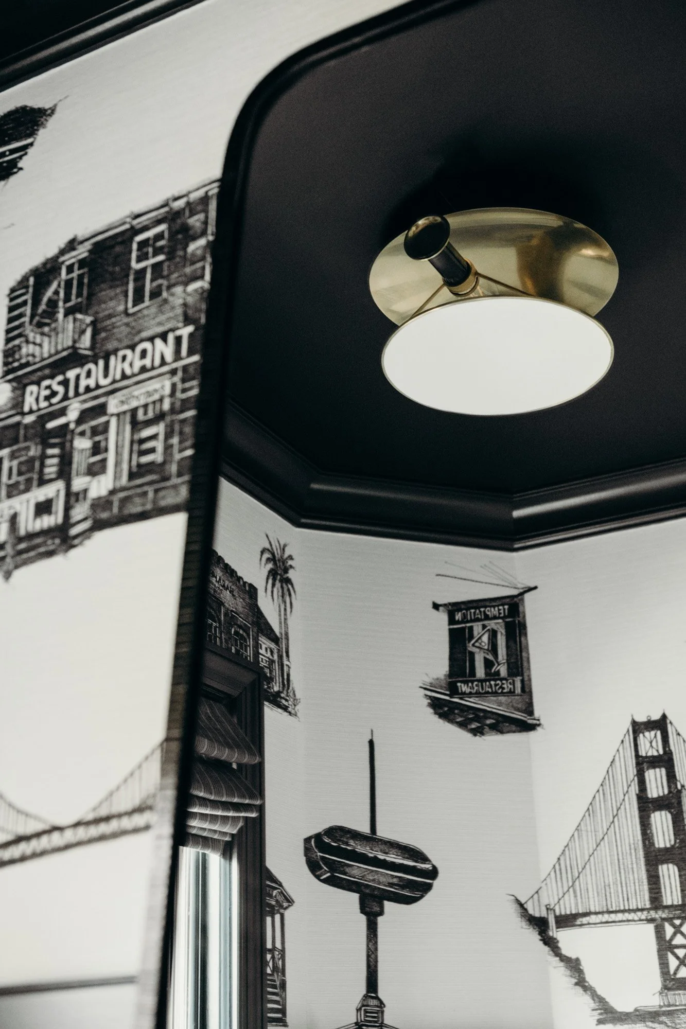
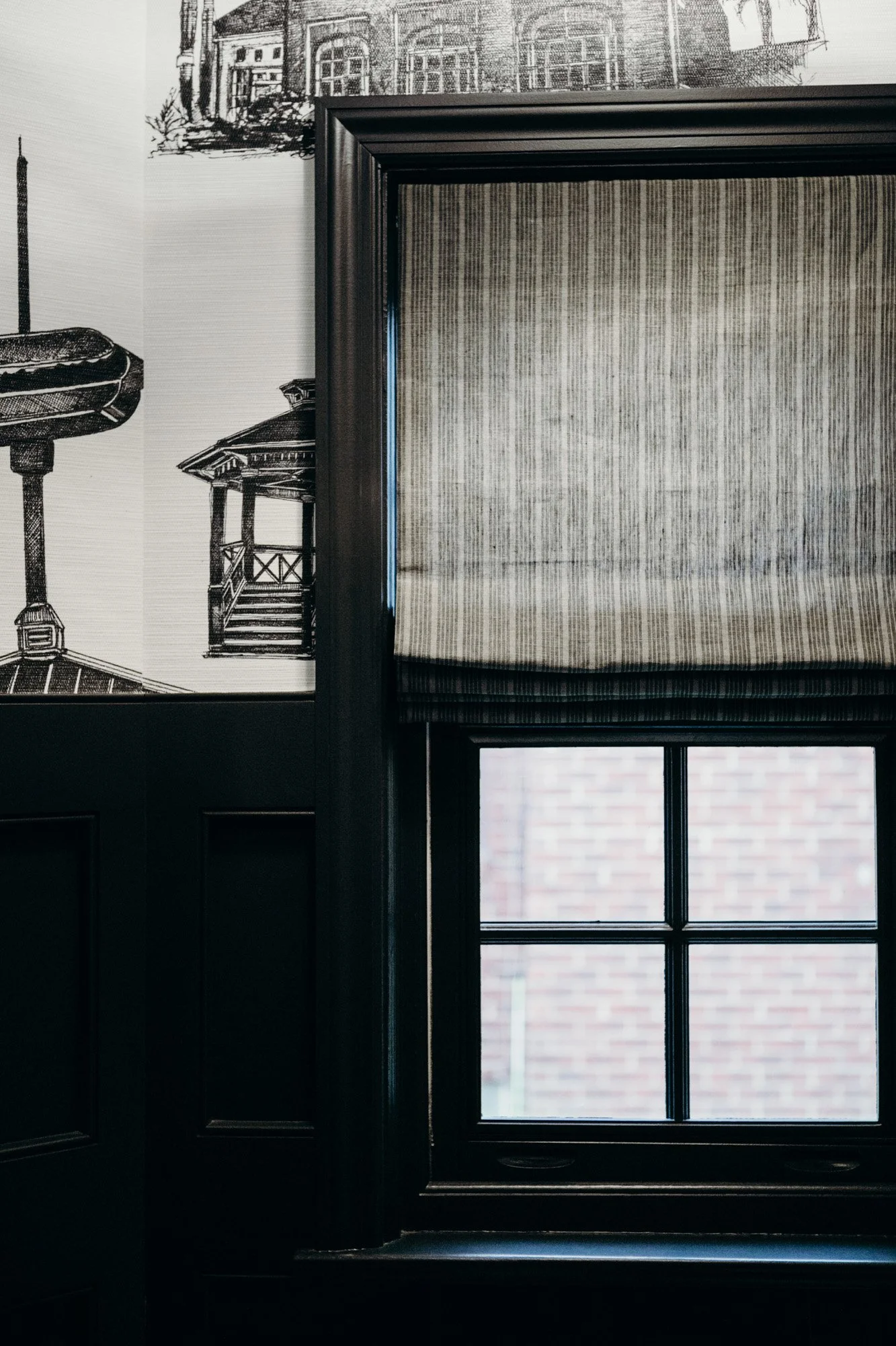
The powder room is a jewel box—overhauled completely with dark blue molding, brass faucet and a Carrara marble vanity. The room’s biggest conversation piece is custom wallpaper conceptualized by the client. The covering features memorable landmarks from travels throughout the client’s life—an illustrator was commissioned to draw them all. Once illustrations were complete, Sadie facilitated working with Phillip Jeffries to create the wallpaper.

